Visions of the Future
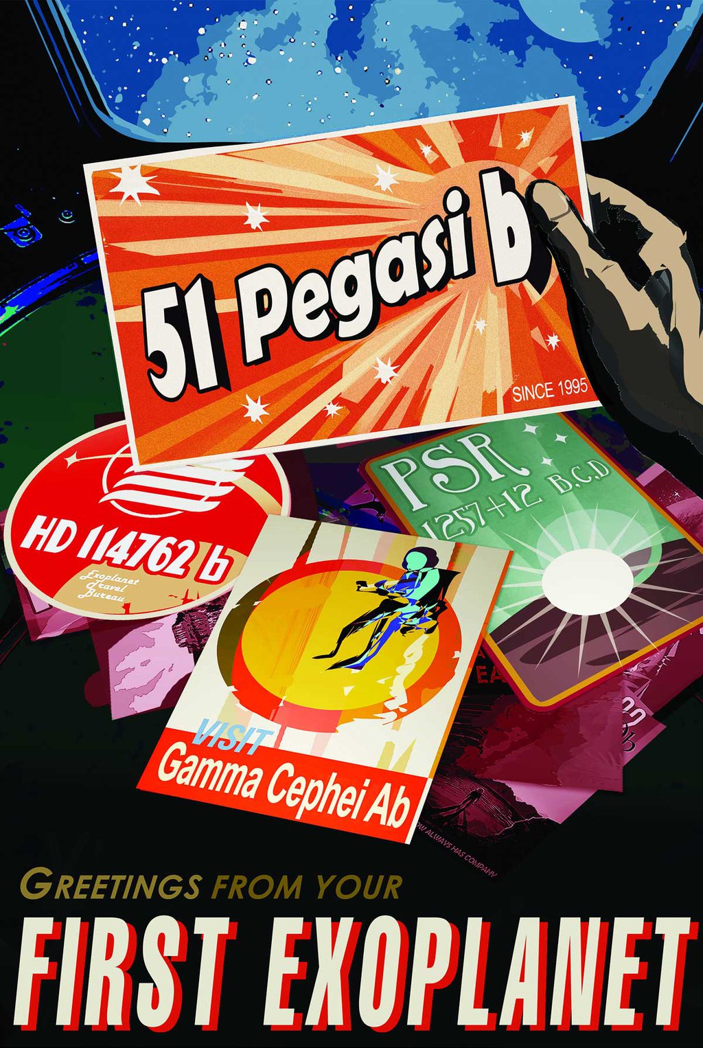
JPL's Exoplanet Travel Bureau presents: Visions of the Future
Imagination is our window into the future. At NASA/JPL we strive to be bold in advancing the edge of possibility so that someday, with the help of new generations of innovators and explorers, these visions of the future can become a reality. As you look through these images of imaginative travel destinations, remember that you can be an architect of the future.
Frequently Asked Questions
Can I get copies of these posters from NASA or JPL?
The images are free for you to print. Please consult the JPL Image Use Policy for further details.
Is it okay for me to print them out myself and display them?
Download the full size posters above so that you can print them and hang on your walls and share with us on Facebook or Twitter.
Do you have other sizes that you haven’t posted, or can you make new ones in a different size?
The current sizes on the website are what are currently available, which are 20 x 30 inches.
Background:
A creative team of visual strategists at JPL, known as "The Studio," created the poster series, which is titled "Visions of the Future." Nine artists, designers, and illustrators were involved in designing the 14 posters, which are the result of many brainstorming sessions with JPL scientists, engineers, and expert communicators. Each poster went through a number of concepts and revisions, and each was made better with feedback from the JPL experts.
David Delgado, creative strategy:
The posters began as a series about exoplanets -- planets orbiting other stars -- to celebrate NASA's study of them. (The NASA program that focuses on finding and studying exoplanets is managed by JPL.) Later, the director of JPL was on vacation at the Grand Canyon with his wife, and they saw a similarly styled poster that reminded them of the exoplanet posters. They suggested it might be wonderful to give a similar treatment to the amazing destinations in our solar system that JPL is currently exploring as part of NASA. And they were right!
The point was to share a sense of things on the edge of possibility that are closely tied to the work our people are doing today. The JPL director has called our people "architects of the future."
As for the style, we gravitated to the style of the old posters the WPA created for the national parks. There's a nostalgia for that era that just feels good.
Joby Harris, illustrator:
The old WPA posters did a really great job delivering a feeling about a far-off destination. They were created at a time when color photography was not very advanced, in order to capture the beauty of the national parks from a human perspective. These posters show places in our solar system (and beyond) that likewise haven't been photographed on a human scale yet -- or in the case of the exoplanets might never be, at least not for a long time. It seemed a perfect way to help people imagine these strange, new worlds.
Delgado:
The WPA poster style is beloved, and other artists have embraced it before us. Our unique take was to take one specific thing about the place and focus on the science of it. We chose exoplanets that had really interesting, strange qualities, and everything about the poster was designed to amplify the concept. The same model guided us for the posters that focus on destinations in the solar system.
Lois Kim, typography:
We worked hard to get the typography right, since that was a very distinctive element in creating the character of those old posters. We wanted to create a retro-future feel, so we didn't adhere exactly to the period styles, but they definitely informed the design. The Venus poster has a very curvy, flowy font, for example, to evoke a sense of the clouds.
Creative Strategy:
Dan Goods, David Delgado
Illustrators:
- Liz Barrios De La Torre (Ceres, Europa)
- Stefan Bucher (Jupiter Design)
- Invisible Creature (Grand Tour, Mars, Enceladus)
- Joby Harris (Kepler 16b, Earth, Kepler 186f, PSO J318.5-22, Titan)
- Jessie Kawata (Venus)
- Lois Kim (Typography for Venus and Europa)
- Ron Miller (Jupiter Illustration)
The Grand Tour
Delgado:
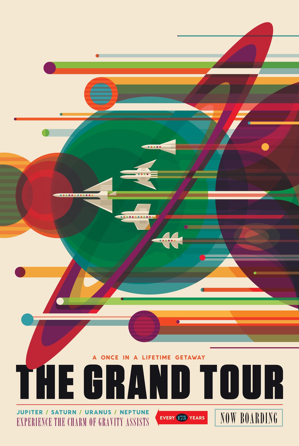
The Grand Tour is the route the Voyager 2 spacecraft took to visit all four outer planets. We imagined this would be something people might want to repeat, since it's a flight plan that's possible every 175 years or so, when the outer planets are arranged just right. In the future, it might be considered "quaint" to experience a gravity assist.
Harris:
Style-wise, the design came from some references we looked at from transparency overlays from the 1960s. It initially had a black background, but we inverted it and the design just clicked.
Mars
Delgado:
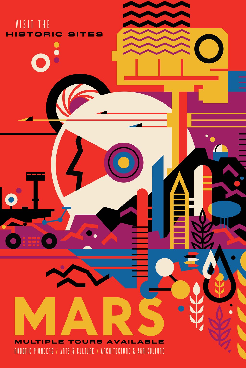
This was the very last poster we produced for the series. We wanted to imagine a future time where humans are on Mars, and their history would revere the robotic pioneers that came first.
There are a few fun things to point out here. You can see the silhouette of Olympus Mons in the background, there's a hint of underground water, and the rover's wheel is spelling out JPL on the ground in Morse code, just like the Curiosity rover does (for what the rover drivers call "visual odometry.")
Venus
Harris:
We tried a few different designs for Venus, starting with the surface, but the intent was to show things people might find pleasant, and Venus' surface is anything but.
Kim:
The scene is of a city in the clouds during a transit of Mercury across the sun. The Morse code for the number 9 is written on the side (signifying the inhabitants are "on cloud 9").
Ceres
Delgado:
The big sign in this poster is inspired by the gateway in Reno that announces it as "the biggest little city in the world." We kind of thought that might suit Ceres. It's the biggest object in the asteroid belt between Mars and Jupiter and probably has a lot of water ice underground.
Harris:
We designed all of these posters as a group, and liked the way this looked with a very muted color palette.
Jupiter
Delgado:
The basis for this poster was a Jupiter cloudscape by artist Ron Miller, who was very gracious in allowing us to modify his painting. In talking with a lead scientist on NASA's Juno mission (which is getting to Jupiter in July), we locked onto his description of the brilliant auroras Jupiter has. It would truly be a sight to see.
Enceladus
Delgado:
Saturn's moon Enceladus is all about the plumes erupting from its south pole. At our first brainstorming session, someone called the plumes "Cold Faithful," and that helped crystallize this idea quite quickly.
There's no right way up in space, so for fun, we turned the surface upside down from the point of view of the visitors in the picture.
Kepler-186f
Harris:
The concept here was about how plants might be very different colors on planets around other stars, since the star's spectrum of light would be different. So we played on an old saying, with "the grass is always redder on the other side of the fence."
There's whimsy in the design, making people wonder why there would be this white picket fence on an alien planet.
HD 40307g | Super Earth
Delgado:
As we discussed ideas for a poster about super Earths -- bigger planets, more massive, with more gravity -- we asked, "Why would that be a cool place to visit?"
We saw an ad for people jumping off mountains in the Alps wearing squirrel suits, and it hit us that this could be a planet for thrill-seekers.
Kepler-16b
Harris:
This was the first poster we designed in the series. The concept was really clear from the very beginning and set the tone for everything that came after. When we showed it to the scientists, the only thing they wanted us to tweak was to make the color of one of the stars (and the shadow it casts) different from the other star.
Harris:
This design fell right out of the tagline, "where the nightlife never ends," which was perfect for a wandering planet that has no star.
We wanted to evoke a sense of elegance, so we leaned heavily on 1930s art deco for this one. It's sort of retro-future fantasy, but again, there's a bit of real science inspiring it.


