Star Map of the Milky Way's Outer Halo

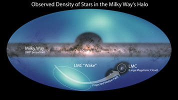
Figure 1, Partial annotation

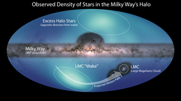
Figure 2, Full annotation
Click on images for larger versions
Images of the Milky Way and the Large Magellanic Cloud (LMC) are overlaid on a map of the surrounding area, our galaxy's galactic halo. Dark blue represents a low concentration of stars; lighter blues indicate increasing stellar density. The map spans from about 200,000 light-years to 325,000 light-years from the galactic center and provides the first clear view of the major features in this region.
The LMC is orbiting the Milky Way and will eventually merge with it. The high concentration in the lower half is a wake created by the LMC as it sails through the galactic halo.
In the upper half of the image, astronomers observed an apparent excess of stars compared to the southern hemisphere. This is evidence that the Large Magellanic Cloud has pulled the Milky Way disk significantly off-center. The galactic halo can be thought of as a bubble surrounding the disk. The number of stars per area is highest near the center of the bubble, and drops off moving away from the center. If the Milky Way were in the center of the halo, astronomers would see an approximately equal number of stars in both hemispheres. But because the Milky Way has been pulled away from the center, when astronomers look into the northern hemisphere, they see more of the central, highly populated area. Comparing these two views, there is an apparent excess of stars in the northern hemisphere.
The image of the Milky Way used here is from the ESA (European Space Agency) Gaia mission: https://www.eso.org/public/images/eso1908e/.
